We used different fonts in different aspects within our trailer. We went through different font choices before picking out the perfect font for our trailer. As this is in fact a horror trailer, we wanted something old fashioned and different to match the theme of our trailer which is poltergeist.
Title font
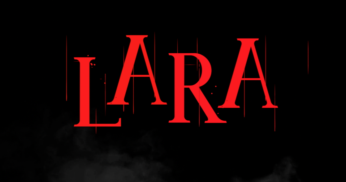
The font we have chosen for our title is 'Crackin' and this can be found and downloaded from 'DaFont'. We chose this particular font, as we liked the simplicity and the boldness because, it stands out. We also chose the colour red in particular, because it symbolises blood, which links to the idea of danger. In addition, this font is similar to the font we have used for our title through out our trailer, which is what we intended, because we wanted the fonts to be similar and not mis-matching, as it would not look as professional as we intended the trailer to be.
|
|
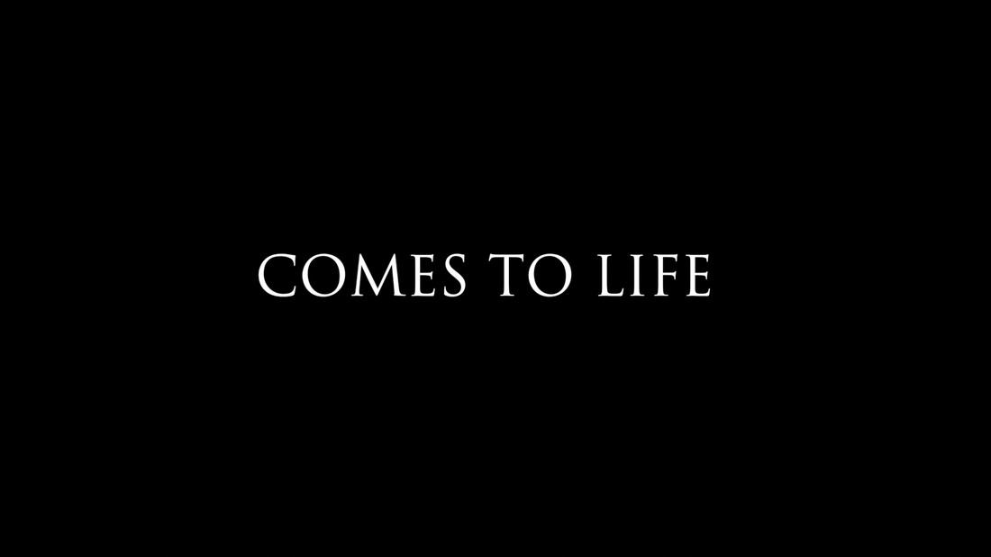
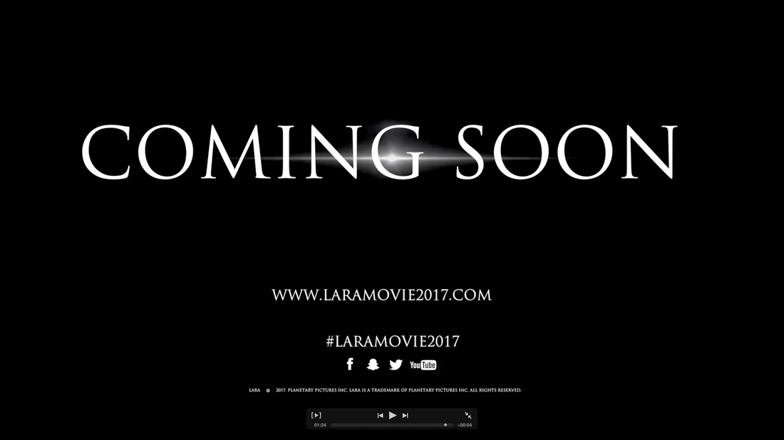
This font is called 'Trajan Pro', and we used this font for titles throughout the trailer, as well as the 'Coming Soon' and small details. We chose this particular font, because it was simple, but at the same time also looked very elegant, which was something we were very particular about for our trailer.
