Various of Magazine choices-
Magazines are important when trying to persuade people to watch a certain film. One of the most known elements to any film magazine cover is the immensely colossal, edited and bold denomination customarily placed within the scene itself; obscured partially by the actor or subject of the headline article. Take for example one of the most popular selling magazine's in the industry - Imperium - who have such a sense of clout to the public that they can afford to partially obnubilate their header beneath the far more advertising star. Nowadays the Star's face in the magazine is important as it would draw more viewers.
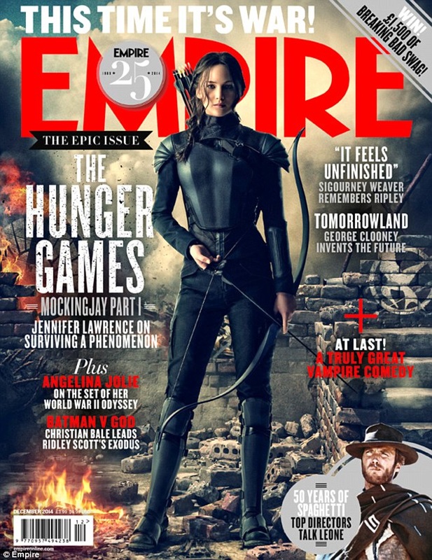
This magazine cover is from the cover of 'EMPIRE' and this was released when 'The Hunger Games: Mockingjay Part 1' hit the cinema. The magazine shows Jennifer Lawrence who stars as Katniss Everdeen in her combat suit and bow and arrow in hand, ready to fight. The magazine's title is big, red and bold, to show what magazine it is. The subtitle is just a little bit smaller in size, but still stands out as it's the title of what is actually portrayed on the cover. This magazine would appeal to both males and females as, it portrays a strong female lead, and to the men as it's a woman playing the lead role, and it's different to your normal cliche superhero film.
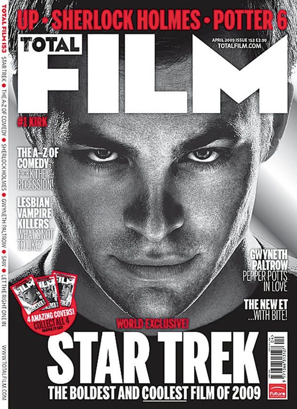
This magazine cover is from 'TOTAL FILM' for the film 'STAR TREK' with Chris Pine on the cover who stars as James T Kirk in the film. The magazine cover is black and white with some red splashed on the page. The title of the film is big and bold and really stands out from the page. The image that's used would attract the female audience as it's attractive photo of a young man.
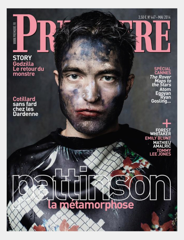
The last magazine cover is from 'Premiere'. The magazine cover stars Rob Patterson, who is a famous british actor that's well know for playing the role of Edward in the series of films 'Twilight'. The colour scheme chosen for the magazine are a good set of colours as it's vibrant and not to blinding. Although it still looks simple just the colours give more to it. Although you can't really see the full title of the magazine, which could cause problems as people wouldn't know what the magazine is called. The size of the fonts are just fine, as they're not too big or too small, but just perfect for the magazine. The image itself would attract women as it's a young attractive man and everybody loves Edward, therefore more twilight fans would attract this magazine.
