In this section we will talk about particular movie posters, in particular horror themed films, and we will talk about what is effective on the poster itself but also why it is effective and the theory behind it. The first poster we will look at is the well known and critically acclaimed "Silence of the Lambs".
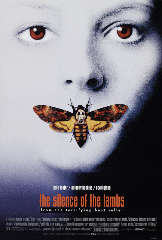
This poster is as good as the film itself, a masterpiece. The way it contrasts the STEROTYPE of having dark and mysterious colours to make the audience on edge and tense. However this poster uses white and yellow which are bright and positive colours but they are used in such a way that it makes the audience wonder what is hiding within the poster and it makes them even more anxious because they don't know what to expect because the poster gives very little away. The title on the poster is even a warm orange colour which is not mysterious or creepy in the slightest and so the viewers will be pondering what is there within this film, and will I be able to cope with what is to come.
Another point that contradicts the typical fashion of horror is the animal choice to 'silence' the victim. A harmless and weak butterfly, this just makes the audience even more concerned because they cannot prepare themselves for what is to come, there is not hints for the audience to know what type of fear there is and even if there is fear in the first place, the audience will began to question themselves making them more vulnerable to being frightened or terrified.
However to ensure that there is something to put fear into the soul of the audience members there is an image of the skull over the butterflies head. This is to symbolise the fact that there is still something that the audience needs to fear, that there is something to make the atmosphere tense and anxious about what is waiting for them.
Next will be.... "scream"
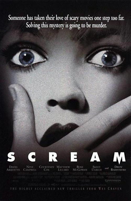
This scream poster is very effective because it uses irony to create subtle humour but also to add a rough and rather unsettling feeling to the audience as the film is called scream, and that makes the viewers think the woman is trying to "scream" for help but there is something, or someone stopping from "screaming for help" and so therefore it is making people feel that she is in danger but no one can help her, as no one can "hear her SCREAM."
The font, of the title specifically, is quite a bold in the sense of expressing "intimidation" because it portrays the unknown within the film poster. In addition to this, The tint of dark colours around the border of the poster itself adds the sense of eeriness and uncertainty as you cannot not see what is behind the black, what awaits you within the film itself.
The font, of the title specifically, is quite a bold in the sense of expressing "intimidation" because it portrays the unknown within the film poster. In addition to this, The tint of dark colours around the border of the poster itself adds the sense of eeriness and uncertainty as you cannot not see what is behind the black, what awaits you within the film itself.
Dexter
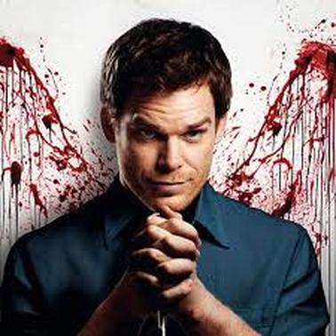
This poster is extremely well designed, this is because of it's simplicity, as just looking at it is a man in a pose with some blood behind him, but it is what that represents about the character in the poster. The pose that he has is an evil one, a man with his hands squeezing together with some pressure and then the facial expression he has... it's like he is telepathically knowing what you are going to do, like he is controlling do. The blood on the wall is showing the evil and cynical characteristics in him, like he is a demon who is flying out from hell. But the clothing is suggesting that he is a normal person, therefore i think the designer wanted to show the audience a message "there is a demon hiding in all of us" and it's just about how people represent themselves into society.
